Archive for the ‘Features’ Category

Win For Losing

Win For Losing is a protest song EP recorded at Audio Bistro, with some guest performers from around the Chicago reggae scene.

The EP contains a Nyabinghi mix and a dub mix by Cale Wilcox.

The tune features Ted Sirota on drums, Chris Paquette on percussion, Shap on saxes, Andrew Zelm on trombone, and Robert Hubbard Alonzo on trumpet.

The song has been appeared on CHIRP Radio Chicago and was featured on the Reggae Vibes show on WLUW FM.

WinForLosing_Cover2

Confessions of an Aphrodite Bug

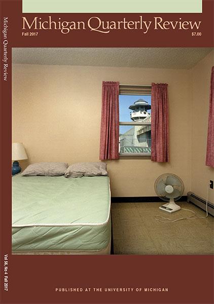
My short story, “Confessions of an Aphrodite Bug”, published in the Fall 2017 issue of Michigan Quarterly Review.

mqr-fall-2017-cover_550x825

CRA Newserator

Newserator is a custom RSS aggregator that I built to break the filter bubble effect in online news consumption.  It allows a user to simultaneously view news feeds from both sides of the political spectrum, filtered by reputation and also keywords.

The feeds are curated in an evolving list of media sources, according to a private set of criteria.  At some point, convening an actual editorial board to oversee the list of feeds is planned.

The host site, Citizens Rights Alliance, is an advocacy site dedicated to the intersection of the Horseshoe Theory as it pertains to Civil Rights.

The goal is to expand minds and illuminate common ground.

Give it a try.

Essay: In Defense of Anti-Science

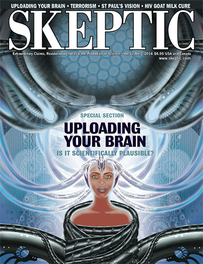
Published in Volume 21, Number 2 of Skeptic Magazine.

It’s obvious that technocracy will have a place in future human society.  As we squelch anti-vaxxers and climate-science deniers, we must be very careful that we also provide sturdy avenues for public feedback on emerging technologies, lest we let technotopia slip into just another form of fallible human oligarchy.

You can read a version of the article on my medium account, as the version in Skeptic is behind a paywall.

Skeptic Magazine Vol. 21 Num. 2

The Red Spot Rhythm Section – Worry: Songs of Homan Freed

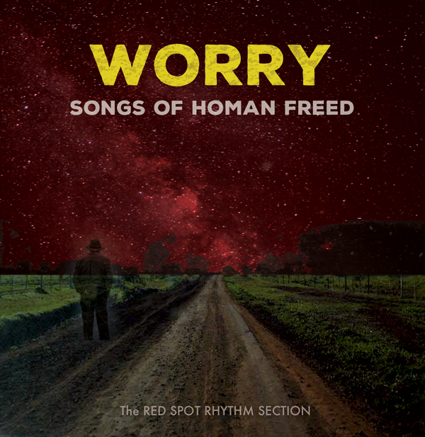
Worry: Songs of Homan Freed is a collection of songs and journals recently discovered from a future broadcast leaked back in time.  The Red Spot Rhythm Section, along with some special guests, have recreated these temporally homeless songs in this brief retrospective.

Worry Album Cover

The Opposition Party

The Opposition Party is a project I cofounded along with Jason Kaulas, Michael Weimann, and Bryan Resendiz, which has grown over the years to include 10 musicians.  The Opposition Party delivers vintage afrofunk sounds with energy and fidelity driven by 4 horns, multiple percussionists, and a tight, grooving rhythm section. Acclaimed vocalist Mark Ford leads the show.

Opposition Party – Live! on Bandcamp

Review: David Bowie Is

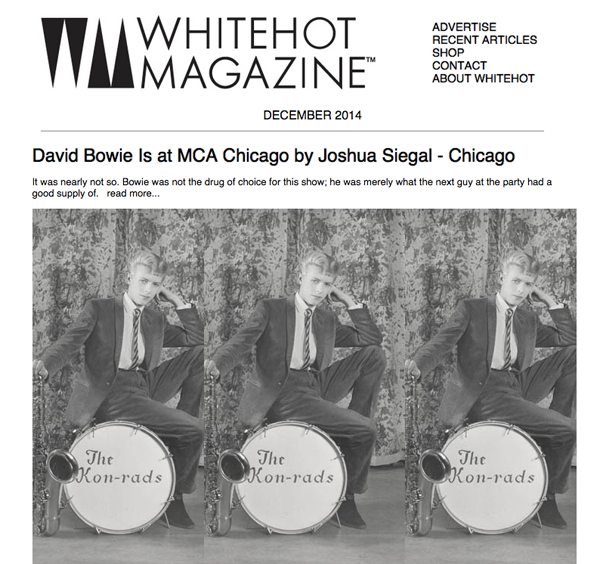
Whitehot Magazine feature

http://whitehotmagazine.com/articles/bowie-is-at-mca-chicago/3090

David Bowie Is
MCA Chicago

By JOSHUA SIEGAL, NOV. 2014

It was nearly not so. Bowie was not the drug of choice for this show; he was merely what the next guy at the party had a good supply of. Geoffrey Marsh, of the Victoria and Albert Museum who first put together this show, admitted as much quite candidly during his press preview with the MCA’s Michael Darling. The V&A had originally wanted another global rock superstar as the subject of this show, he who for legal reasons must not be named.  That show fell through, and was shelved, until the opportunity to work with Bowie’s archivist came knocking.

It has long ago been proven that art can live and breathe on the Rock and Roll stage.  With the David Bowie Is exhibit, the MCA Chicago and its partners attempt to prove not only that the reverse is true but also that a well-scaffolded marionette show can bring Rock and Roll detritus to life.

David Bowie Is must certainly be a coup for the MCA Chicago, at least financially speaking, but we probably won’t hear anyone in London, Paris, or Berlin crowing about seeing the names of their cities listed alongside the others.  Chicago considers itself a global metropolis, but, with its second-city neurosis, it often acts a bit like a backwater “world-class city,” one that feels compelled to proclaim itself such.  The triumphalism of the press surrounding the MCA exhibit reveals a lot about the state of modern art in the “Paris of the Midwest”.

London: Bowie’s birthplace, capitol of his native country, backdrop for his nascence.

Berlin: adopted home and locus for a period of Bowie’s creative reincarnation.

Paris: a fashion mecca.

Cleveland’s Rock and Roll Hall of Fame is where this exhibition properly belongs, stylistically and contextually. If the MCA dreams of repurposing an entire floor as the North American Museum of the Natural History of Rock and Roll, this show would be a winning shot across the bow.  If it intends to remain the Museum of Contemporary Art, then we must be content to let them cough into their sleeve and collect the admissions fees.

Cultural history transplants rather shamelessly to disjointed locales. This is unabashedly a collection of artifacts, which – though presented chronologically – tries to reassure everyone that it’s not a retrospective.  When the remains of Tutankhamen came to this city, they were appropriately hawked for viewing not at the Art Institute, but at the Field Museum, alongside dinosaur skeletons and Native American dioramas.

MCA patrons of the Bowie exhibit will breeze past a small and completely free chamber of dangling Calder mobiles, straight into the maw of an expensive synesthetic leviathan.  This is not to say that the show – as spectacle – is unworthy of the door price.  Technological plumage can be expensive to display, and in this, perhaps, the show finds a kind of conceptual match: Bowie was a technological innovator – this show is innovative.  Get it?  But what plumage – location-aware headphone sets allow the visitor to experience an audio scape digitally cross-faded, tailored to his or her personal wandering proclivities (running haphazardly through the exhibit space produces a fantastically surreal live audio piece, though one not endorsed by the security staff.)

At this, the matter and presentation are expertly married: what better subject than a musical icon of the video age, to pair with roaming audio technology?  Interview snippets blend through the various zones with recorded music, which itself reveals as synced video soundtrack, but only as the video comes into view. There is much to absorb here in exhibit-craft.  Banished is the over worn “video bench” where tedious pieces loop at length in a tomb: no video among the many on offer lasts longer than three or four minutes, all of them nestled in some larger context.  Digital media leaps from and winks at glass-cased artifacts from its own past: Bowie’s handwritten notes, sketches, storyboards, and paintings. Well-placed mirrors render interlaced 1980s videos into appropriately trippy dimensions and a recreated studio room cascades talkback ghosts and out-take voices down through the space.  The viewer is like an ant wandering on a circuit board inside the head of robot Bowie, stunningly attired in one of his glittery costumes.

The culminating interdisciplinary face-stuffing of the exhibit is a room that splashes together live concert footage, a novel 3D sound experiment that attempts to recreate audio immersion in said concert footage, a stand of theatrically garbed mannequins, stage plotting dioramas, rock show lighting, and video montage.  This is the grand finale of the fireworks show and it doesn’t quite come together, but it’s effective in the same way that being vomited on by a loved one is effective: undeniable, and hilarious to the degree that it’s somehow pleasant – it’s Bowie overdose.

So the exhibit really is the exploration of the real history of a fake persona, which was almost a completely different real history of a completely different fake persona.  All dealt out with extreme care and precision. What a happy accident that the eventual subject was such a technologist. Maybe there is some resonance here with Bowie’s use of oblique strategies? Maybe Bowie’s references to McLuhan are eerily prescient, in that his personas have been supplanted in this exhibit by the medium, namely the exhibit itself?  Maybe this all belongs in a contemporary art museum after all, if we are prepared to accept an ossification of contemporary art, that it will already start listing toward its own past, and turn into the visual corollary of jazz.

For anyone interested in how multidisciplinary installations come together, this exhibit (and perhaps the film that’s already been made about it) should be worthwhile and indeed exemplary.  For anyone interested in the relatively narrow topic of the expansive history of David Bowie, this show will be a delight.  Those who hold out hope that modern art can continue to thrive and churn without huge influxes of cash will come and gaze at this exhibition with horrific appreciation – like a rockabilly daddy-o witnessing Ziggy Stardust emerge from a limousine.

N^ The Game

N^ The Game

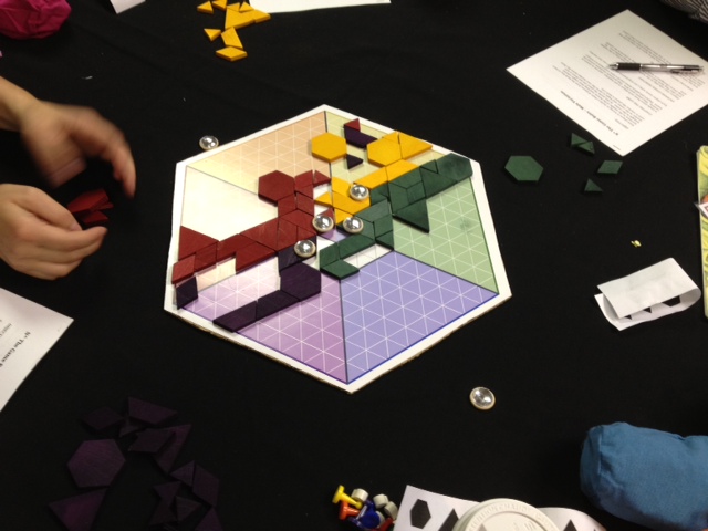
N^ The Game is an original board game in development, currently in the playtesting phase.  N^ comes out of some thoughts about game design, resources, and geography: N^ is a game where players compete for resources, but they do not dominate or take away one another’s territory.  Don’t worry – there is plenty of deviousness and strategy, and common resources are limited.  In my mind, this represents a close analog to our current geopolitical situation, where major powers are unlikely to risk all out war, but will formulate and reformulate devious plans to capture resources / deny competitors.  The direct cartographic inspiration is the situation at the north pole of our planet (hence the name).  This is a game for 2, 3, 4, or 6 players, and alliances will naturally form and break (heh heh).  This mechanics / play of the game also take some inspiration from cellular automata, particularly Conway’s Game of Life, and the idea of game pieces “surviving” based on certain population criteria.  (There are also certain similarities here with the venerable game of Go.)  As for the winning conditions, there are also ideas operating in this game about cooperation and resources.  The competition is strident, but everyone ends the game with the same pieces and territory as they started with.

N Logo
The single logo
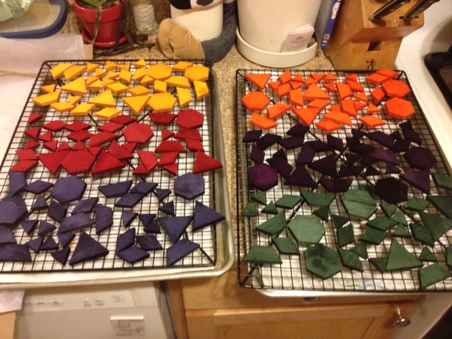
Preparation of the game pieces

Update 7/23/2015: Chicago Playtesting

JK_1
JK_2

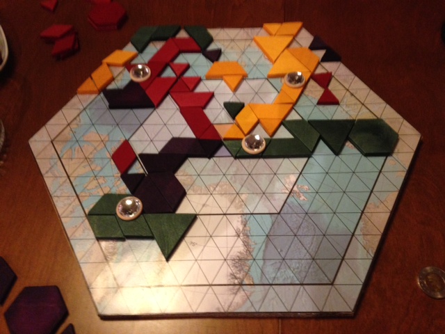
A new board direction, and getting some rule tweaks down.  An interesting iteration.

Update 7/17/2014: Chicago Playtesting

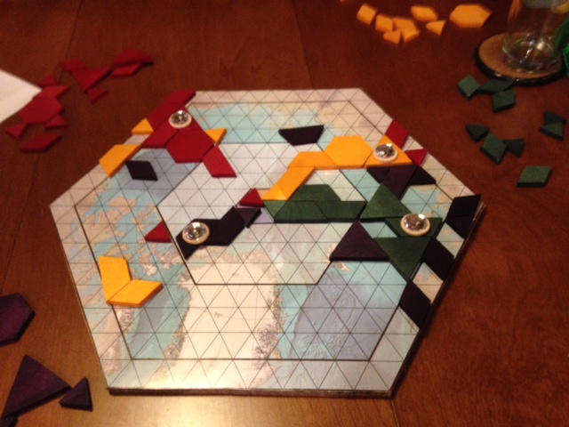
Winning Position from July 17 Playtesting; second iteration

Here’s the winning position from our July 17 playtesting session, working with a 5-player version and some great new rules iterations.  Coming along nicely now, working on the balancing out.

Update 3/24/2014: ProtoSpiel Milwaukee

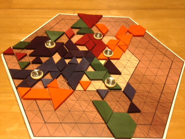
Playtesting N^ at ProtoSpiel Milwaukee

Had a great time playtesting N^ The Game (among others) at ProtoSpiel Milwaukee this weekend.  We went through a couple of different rules iterations, and overall I was quite pleased with the way the game played out.  Thanks to Scott and Wooz especially for their insightful comments and gameplay, and we had a great time playing their games as well!

the Morphtet

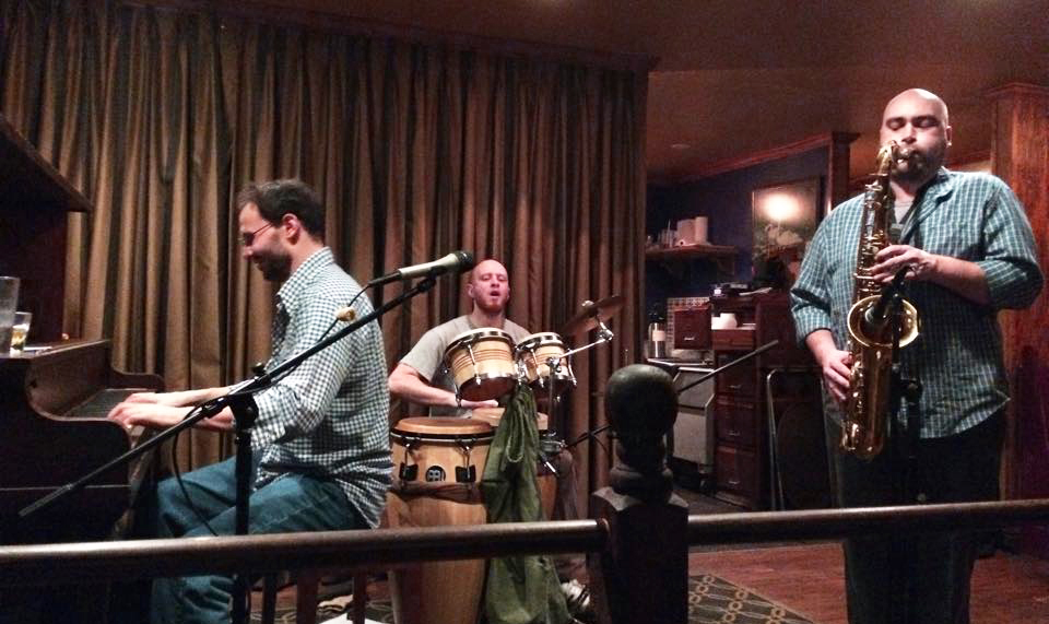
The Morphtet is a piano trio based around the concepts of acoustic interaction and melding barrlehouse with polyrhythms.

MorphtetHonkyTonk228

themorphtet.com

Review: In Decay: Stitching America’s Ruins

Whitehot Magazine of Contemporary Art, August 2012

Eric Holubow and the Presumed Descent of America

Amid hand-wringing and finger-pointing over the presumed descent of America sits Eric Holubow’s photography, nestled into a corridor at the Chicago Cultural Center, as summer tourists stop by to gawk at the pristine renderings of tragic architectural wrecks. Dentures out, wig mislaid, houserobe open, arcing in some graceless pose, these structures hold their pride in dilapidated openness, grateful to be sought before the final collapse. From an architectural (though not technical) standpoint, Holubow is Paparazzi in the nursing home.

The work has been seen by many – including the artist himself – as emblematic of a cultural autumn, or mutely damning exhibits in some prosecution. The title of the CCC showing is “In Decay: Stitching America’s Ruins”, and the metaphor is accurate in that the works indeed form a coherent whole, a fabric felted of fraying scraps. But this is not simply socioeconomic documentary photography, Holubow is not merely an archivist, and he seems in his writing to neglect his collaborators, namely the great forces of Nature and Time, as if the gorgeous forms he captures were scandalous social narratives and not irreplaceable works of generative art.

What is the difference between generative art and what we might call (with a wink) degenerative art, the art of decay? In both cases, the artist’s control is in the parameters, and at this, Holubow proves able to set his frame with great sympathy and circumspection, and in many of his images, you can feel the labored breaths of these once-ornate cavities. In “Prison Block”, a shot inside a Tennessee prison so onerous that a state law was passed forbidding its use, a single pole unevenly bisects the frame, rising to the peeling roof, and Holubow’s lens distorts the cellblock rails so that they curve away, both opening and compressing the space, lending action and intimacy to what must be oppressively drab rectilinear environs.

Sharing space with “Prison Block” in the exhibit is “Nuclear Potential”, a squat concrete cylinder viewed from within its circular enclosure. The photograph has a quite static composition, but it is electrically alive. Moss of a radioactive comic book green lingers innocently as rebar twists skyward above the never-completed reactor housing. Short, empty pipe ports gesture to nowhere. Cut through the curving concrete face is a perfect square, and through it we can stare past its opposite at the back of the enclosure. In many of the pieces in “In Decay”, Holubow presents us, center frame and sitting quietly at the rear, with a door or window we might not notice at first glance.

One such door greets us as we face laterally across Gary Indiana’s Palace Theater, on a balcony edge which curves away and back again to the middle of the frame. Above, the blue-tiled roof has some blotchy disease. Below, a drape with a faded Mediterranean scene still hangs gamely from the proscenium. All of the seats on the main floor are scattered and flattened in a delicious array of scalloped orange forms. The orchestra pit is shamefully exposed, made up in white dust. Above, set into the middle of the opposite wall, a story above the floor, sits the intriguing little door. It is easy to imagine that it leads mischievously to a straight drop down the exterior of the building. Holubow does not show us any exteriors, but these doors and windows cunningly featured hint at a way out – maybe, for the artist, at rescue?

More overt are the beams of light which Holubow captures blasting through cracked stained glass, or else spilling through fissures in ceilings. These luminous interlopers are unnecessary, especially in the case of the many religious interiors captured in this show. The world is littered with religious structures in all states of disrepair, and though their plight is moving and their interiors often gobsmacking, the artist edges disturbingly close to postcard elegies with some of those shots. Part of western religion itself is the tension between the ever-denuding material world and the promised lofty constancy. There is more pathos in the show’s degraded utilitarian spaces.

In a ruined Detriot apartment building lobby, a single chair ignores a baby grand piano pitched forward on its face, its lids open to eternity, its keys unevenly serrated like a player piano frozen in action. A lonely textbook rests in an abandoned classroom, where graffiti decorates the chalkboards and the ceiling has flaked down to cover the children’s desks in with a scatter of serene paint chips, and the cathode-ray television set above on the wall is pristinely preserved. At the Packard Auto Plant, saplings thrive under the angled glass factory roof, which looks out like a wrenched-open greenhouse on acres of drab green farmland. These are the better moments – and they are moments – as many of the structures featured no longer exist.

The exhibit begs to draw us into this chronology, with flatly described histories posted next to each photograph; though interesting, these statements do not explain or improve the resonance of the pieces, which lies in the physical and anthropomorphic subjects and the gentle, accurate care afforded them by the artist. Given the tendency to see ourselves in our constructions, we might connect this exhibit with an inhumanity, a callousness, but sympathy for victims is insufficient: to a photojournalist, there is a story. If the story here is the sorry state of neglected eastern American buildings, then we have some entrancing assets for the local paper’s editorial page. But there is more. Take, for example, the medium-size prints of these cavernous spaces. In resisting the urge to render them in large format, Holubow gives us two dimensional dioramas, into which we peer at characters who are works in progress.

The grainy facade of the imposing dome in a New York tuberculosis hospital is pitted with bits of color, as if a pixellated projection were fixed on its surface, while at its center a stately, radially symmetrical, and quite intentional piece of stained glass stands ground amid the noise. In another piece, a five-part tapestry of windows reveals the tableau of their exterior, a skeletal, rural backdrop progressing to the new commercial, the building itself observing its own past and unreachable once-future. All this is seen in random keyhole hints, through spattered patterns of fractured industrial glass.

In gnarled rebar and capricious splays of lumber, we see the human hand, but the human hand removed. In its place step the natural forces, firm and sure, sparing parts and laying waste to others, as chaotic, detailed, and grandiose as the best code art iterations, and infinitely more expressive. Our senses themselves follow such natural patterns, in nerve endings and optical cones and the tangled improbability of our brains. Whether one prefers the sublime proportions of classical architecture or pulsing organic forms, the clash of these impulses informs everything aesthetic, and it is this clash – not economic decrepitude, not cruel neglect – which humbly animates Holubow’s photographs.

Then we walk out from the exhibit into the exquisite foyer of the Cultural Center itself, and eye the stonework and glittering mosaics, and wonder if we’d wear the same aesthetic blinders, were this luscious public landmark – with its crown, largest Tiffany dome in the world – to appear in one of Holubow’s photographs, and itself become a piece of future wreck-porn, and we think then again, maybe Holubow has a point.

Published in Whitehot Magazine of Contemporary Art